Out of Order
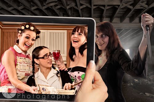
This article is supposed to accompany this one. Oh well. I kept putting it off because explaining anything having to do with Photoshop is complicated. So I decided to make it more pictorial that “word-orial”….ugh….did I just say that? Anyway, with many images and few words here’s how I assembled this image in Photoshop: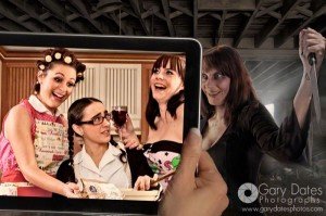
Right off the bat, this photo was assembled with 19 separate layers. Actually, it was more like 25 or so, but I combined several layers at certain points. It turns out that 19 layers isn’t all that tough to manage, nor is it a huge amount, relatively speaking, so I’m not trying to impress anyone with layer-count. That’s a bit like trying to impress someone by how much $$ you spent on a camera. No, I’m pointing this out up front to let y’all know that I’m NOT gonna do a layer-by-layer deconstruction of this photo, so if you are a Photoshop novice there will be some things that confuse you.
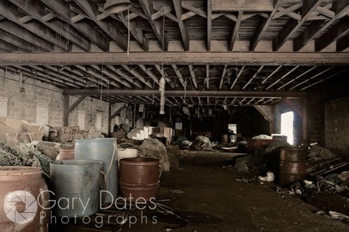
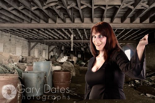
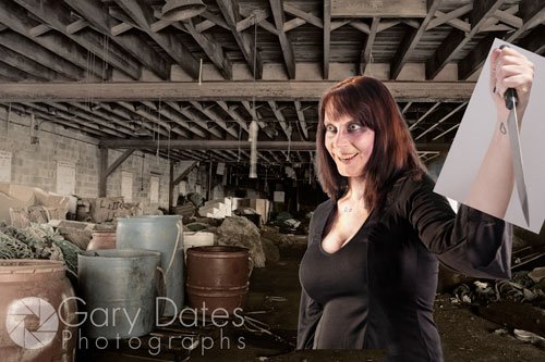
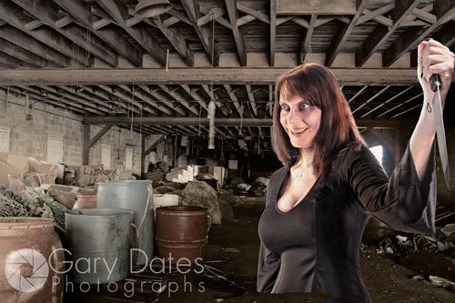
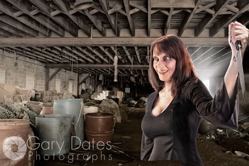
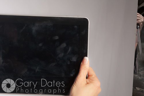
The first image is the background for the entire shot. Here it is as it looked straight out of the camera: Pretty straight-forward. I wanted to give it a hyper-detailed look, so I performed a bit of Photoshop trickery. I first brought the image into Photoshop just as it looks above as a Smart Object. I then used the “New Smart Object Via Copy” command to create a new layer with the same image. “New Smart Object Via Copy” will create a copy of the same image as a Smart Object, but you can edit this new layer in Adobe Camera Raw (ACR) INDEPENDENTLY of the original Smart Object. If you simply made copy of the original layer, any edits I made to the new copy in ACR would be reflected in the original layer as well. Anyway, I opened this new layer into ACR (v6.6 -this is pre CS6) and converted it to B&W, moved the Fill Light slider all the way to the right, moved the Blacks slider to +83, and the Contrast slider to +78. It looked like this: I then changed the Blending Mode of this layer to Luminosity. The creates a hyper-detailed look….exactly what I was after. Here is the result: Next, I added the “ghoul” into the shot: I simply created a Layer Mask to get this: Next I added the knife photo: As before, I created a Layer Mask to get this: I then did the same hyper-detail trick that I did with the background, and added some fake rim light on a new layer. I then rasterized the Smart Object layer of the ghoul, and did a bit of Photoshop “lipo-suction” using the Liquify filter to make the model a bit thinner, and got this: Next, I added some fake light rays behind her: Finally, I lowered the Brightness and added some mist to get this: FYI, all of the above additions were created on separate layers. If you want more info on Masking, you should check out some of my video tutorials on the subject. This one is a good place to start, because it explains how to extract an element from a photo using Refine Edge, which was much-improved in CS5, and now CS6. this part was easy, because the iPad has straight lines so is therefor easy to add on it’s own Layer with a Layer Mask. It looked like this below: Once I masked out the background to leave the hand and the iPad, it was easy to add the photo that sits inside. FYI, I did the same hyper-detail trick on that photo as well, before I brought it into this image: My final move was to darken the iPad and hand to match the background a bit more. I believe the “devil is in the details” as they say. If the image is to look convincing, it is the little details that make it so. I mean, let’s face it. I know whenever I stand in a dark room with a knife-wielding ghoul, my iPad screen looks pretty bright.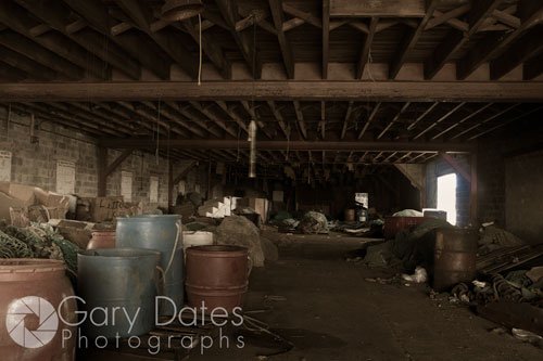




Adding the iPad
FINALLY The End